Avis booking flow redesign
As the Senior Product Designer at Avis Budget Group, I led the overhaul of the digital booking system across multiple brands, focusing particularly on the Avis website. The original booking flow was inefficient and provided a subpar user experience.
My objective was to reimagine this flow to enhance user engagement and conversion rates, significantly reducing user drop-off. Additionally, I provided ongoing support and mentorship to other designers in the team, guiding them through design challenges and ensuring cohesive project outcomes.
My role
- Senior Product Designer
- UI Design
- UX Design
- User testing
- Research

In 2019, I assumed the role of Senior Digital Product Designer at Avis, where I was tasked with revamping the booking flow on their website. This critical project involved a holistic update of both the user interface (UI) and user experience (UX), designed to streamline the process and enhance customer interactions with the platform.
User Interface
To modernise the website, we implemented a new UI design that aligns with current design trends, featuring a clean and straightforward layout to enhance user navigation. The redesigned interface includes larger call-to-action buttons, minimalistic content to reduce clutter, and ample white space to create a breathable, uncluttered aesthetic.
User Experience
Extensive effort was dedicated to refining the user experience for the new booking flow, focusing on a user-centric design that meets our customers’ goals. Through iterative research and testing of layouts, language, and calls-to-action using various UX techniques, we aimed for an intuitive and engaging interface. Additionally, we continuously utilise in-depth analytics to optimise and enhance the booking process, ensuring it is not only efficient but also enjoyable and stress-free for users, ultimately increasing car hire conversions.
Before
The previous UI was outdated and featured a dark colour scheme that, combined with an excessive number of clickable elements and messages, led to user confusion and a sense of being overwhelmed.

After
The UI has been updated to a cleaner, more modern design that emphasises white space, enhancing visual clarity and user focus. We’ve optimised content placement so more crucial information appears above the fold and simplified the top navigation by reducing the number of options, to avoid overwhelming users.
Clean homepage
The homepage has been redesigned to include a streamlined booking widget strategically positioned on the right, allowing prominent placement for marketing messages on the left. This layout enhances usability while maintaining a clean, modern aesthetic throughout.
Select your vehicle
We’ve introduced a new results screen featuring a step tracker that informs users of their progress throughout the booking process and allows for modifications at any stage, a significant improvement over the previous system where restarting the booking was necessary. This screen utilises a clean UI design with card-based result displays for better clarity and user experience.


Select your level of cover
Avis places a high emphasis on upsells, particularly insurance options, making the design of these offers crucial. It was vital to create a clear and effective layout that not only allows customers to easily find and understand their insurance options but also maximises Avis’s potential for profit through well-presented, transparent information.
Add your extras
In the car rental industry, extras and ancillaries represent a significant revenue stream. Therefore, having a UI that is not only effective but also optimised through rigorous testing to enhance conversion rates is critical for the success of a car hire business.


Complete your booking
The step tracker UI in the booking process seamlessly transitions into a booking summary, maintaining the same layout and information for clear visibility of the user’s selections. Additionally, the design includes clean form fields with ample white space, organised into distinct categories to simplify completion and prevent user overwhelm.
The Atomic Design System
At Avis Budget Group, we implemented an Atomic Design System for our website and projects, ensuring a high level of design consistency and precision. This system structures components using a hierarchy of Atoms and Molecules, which allows multiple designers to work synergistically on projects without compromising on design quality or coherence.

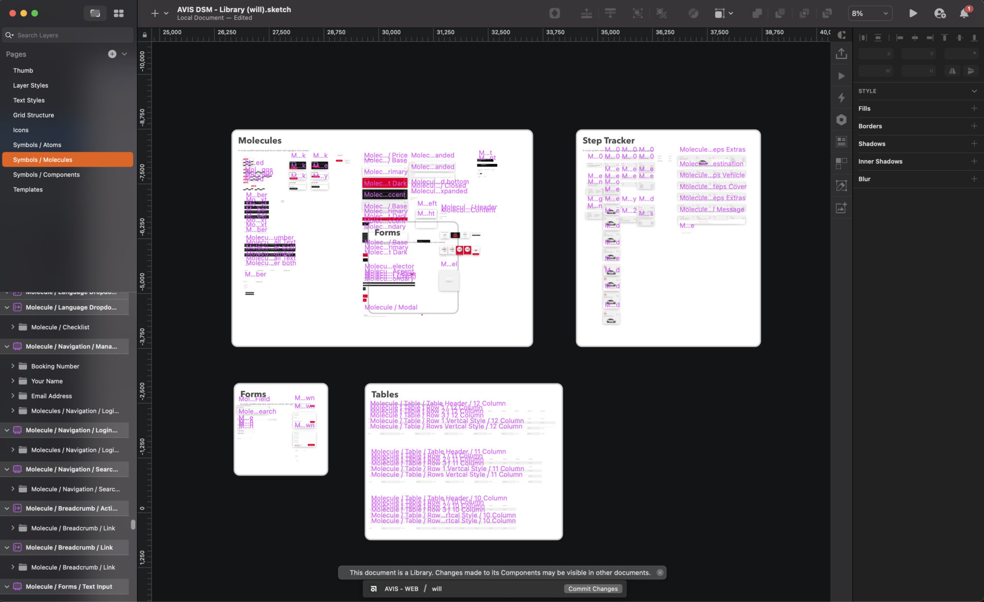
The Pattern Library
At Avis Budget Group, we complemented the Atomic Design System with a Pattern Library, which acts as a development-focused toolkit. While it shares principles with the design-oriented Atomic Design System, the Pattern Library’s components were pre-coded and ready for use, allowing developers to efficiently build and deploy website pages. This system when combined with the Sketch library of components, ensured that all designs remain consistent with the codebase and enabled the designers to deliver precise and accurate work.